
Social
Security
Administration
Role
Product Designer
Evaluator
Date
January 2022 - March 2022
Methods
Competitive Analysis
Heuristic Evaluation
Usability Tests
Prototyping
Project Overview
Background: As part of our graduate curriculum for MHCID, we collaborated as a design team of 5 to evaluate an existing product on usability metrics, hypothesize challenges, ideate design recommendations, and conduct usability tests. After concluding the initial research, I was individually tasked with designing the interface and prototyping a design solution.
Our system focus was SSA.gov, the official website of the federal government’s Social Security Administration. Our efforts highlighted the process of applying for disability benefits. To accomplish this, we conducted a usability evaluation consisting of heuristics evaluation, competitive analysis, and user testing to provide evidence-informed recommendations for improving the online experience of SSA.gov.
Problem Space: Social Security Disability Insurance (SSDI) is one of the most common federal benefits providing financial assistance to recipients with limited income and resources – typically seniors and persons living with disabilities. Without access to these benefits, people risk the loss of income to meet their basic needs (9.5 million adults receive SSDI in 2021). SSA.gov is the only platform for people to apply, so we want to facilitate improvement opportunities so users have more access to and knowledge of resources available to them.
Problem Statement
How might we make finding information on ssa.gov easier?
RESEARCH
RESEARCH
SYNTHESIS
IDEATE &
DESIGN
USABILITY
TESTS
FINAL
DESIGN
Who are our users?
How do our users find information on qualifying for disability?
To inform our understanding, we individually conducted usability evaluations on these tasks and discovered what elements were creating challenges to complete the tasks.
Task 1
Navigate website to find requirements/ eligibility for disability (SSDI) benefits
Task 2
Apply for disability
“Ed” is used to guide hypothetical issues and needs relevant to the problem space.

Discovery
Gathering Data: Heuristic Evaluation
Using Nielsen’s 10 usability heuristics, a set of industry-standard design principles, to frame our evaluation, we gathered our data after critically exploring the system.
We performed a heuristic evaluation with a focus on the experience of users looking to learn more or apply for disability benefits. Equipped with a persona named Ed, each team member individually evaluated the website against Nielsen’s 10 usability heuristics. The team then came together to share and discuss their findings. All data was organized under a specific heuristic during the initial session.
After the initial organization of individual findings. We used an affinity diagram to organize the usability issues into larger categories. We found that many issues discovered through the heuristic evaluation fell within these areas: navigation, text hierarchy, and visual design/UI.


An affinity diagram was used to organize initial usability issues based on the 10 heuristics. Pain points were categorized in three major areas.
Key Insights
Our largest area of usability issues - although technically the user has everything they need to learn about & apply for disability, major issues surrounding wayfinding, accessibility, and lack of breadcrumbs hinder progress in these objectives.
The ssa.gov site is rich with information - and is incredibly dense and difficult to read. The user is forced to navigate text-burdened pages that lack consistency, proper headings, and easily scannable text.
While visual design is not of high importance to our client, many usability issues including icon consistency, modal differentiation and coloring of clickable elements create confusion for the client’s user, who would benefit from improvements to the current visual design.
Research
Gathering Data: Competitive Analysis
To conduct our market comparison, a competitive analysis was undertaken from the perspective of a user who was previously employed, incurred a recent disability and wanted to learn the public and private benefits available to them. We compared SSA’s product and website usability to similarly placed programs. Our goal was to understand the differences between the programs, as well as find opportunities to improve the user experience of the SSA.gov website. This comparative evaluation features direct competitors (The California State Disability Insurance (SDI) program, Breeze, Haven Life), indirect competitors (Medicare/Medi-Cal), and an international influencer (Norway).
Key Objective: Our evaluation focuses on three key usability issues derived from our prior heuristic evaluation, this helped guide our focus when analyzing competitors. Additionally, we approached our analysis as a user looking for disability information.
Current Competition: We have compared three direct competitors, two indirect competitors, and one influencer. For breadth across the industry, we have considered state, federal, private, and international resources for disability.
Expected Outcomes: Utilizing insights from a broad range of competitors allowed me to verify design recommendations from my prior heuristic evaluation, and gain an understanding and visualization of positive & negative usability features that SSA.gov could implement.
Defining the Competitors
Competitors occupy similar and adjacent spaces to SSA, from state and federal government to private organizations. Comparing usability metrics are framed through an evaluation of each competitor site’s navigation, text hierarchy, and visual design.


Key Insights &
Takeaways
Ultimately, SSA’s market strength was difficult to measure due to variables such as: eligibility requirements, income limits, and employment history. Direct competitors offered long-term benefits only if applicants were pre-enrolled prior to incurring a disability whereas SSA is the only entity that allows applicants to enroll after becoming disabled, offering financial assistance due to loss of income.
Regarding usability, most competitors had designed more streamlined systems based on our three metrics: navigation, text hierarchy, visual design. With some strategic changes based off our competitive analysis recommendations, however, ssa.gov can be just as effective and pleasant for users that are researching their disability options.
Gathering Data:
Usability Tests
After conducting heuristic evaluation and competitive analysis, we identified key areas to analyze when approaching our user research. Participants primarily consisted of U.S. citizens, within the age criteria of 18-65+ who qualify for disability benefits, regardless of whether they received them prior.
Data Analysis: The current SSA design was tested using four methodologies to understand behavioral insights - the context of how and why people use the site, how they navigate it, and their mental model in accomplishing the task of finding eligibility criteria.
Recommendations
-
Adopt Sticky Navigation: navigation anchored on long pages gives users more control.
-
Make searching simple: ensuring an intuitively placed search bar and internal results by relevance.
-
Use Collapsible Sections: content should be adjustable to users, they can toggle to read more.
-
Improve CTAs: Using consistent and engaging call-to-action buttons helps users in identifying next steps.
-
Integrate breadcrumbs: assist users in navigating where they are in the flow.
Card Sort

Using pre-constructed headers from the site, 40 participants were tasked to sort the headers into categories, comparing the current information architecture with users’ mental models.
-
67% created categories by grouping labels - apply, documents, profile, and disability - together.
-
21/40 successfully completed the card sort suggesting discrepancies with users mental framework vs. the current arrangement.
Surveys

We conducted a survey with 29 participants across various demographics, 52% of whom previously used SSA.gov.
-
What are your goals?
-
50% Learning about Services vs. 33% Applying for services
-
-
If you could improve one thing
-
41% The way info is presented
-
32% The Navigation
-
Visual Design
-
-
Which tasks are most important?
-
36% Understanding benefits
-
24% Understanding eligibility
-
12% Checking for document requirements
-
12% Completing an application
-
12% Viewing the status of an application
-
-
Rating the ease of finding eligibility
-
45% Moderate vs. 18% Moderately Easy / Difficulty
-
Qualitative Test

Using a remote, unmoderated study, we compared how 6 users navigate EDD and Breeze vs. SSA
-
100% of participants favored the navigation of the competitor’s sites over SSA.
-
Poor informational organization made it difficult and preferred recognizable headers over jargon.
-
Intimidated by text-heavy pages.
-
Confusion cited when their primary/expected tasks were not included in Table of Contents.
Quantitative Test

Using an exact prototype, we asked 22 participants to find the basic eligibility to qualify on SSA.
-
Users were drawn to buttons for solutions
-
Content Pages Are a Priority
-
Most are drawn to clicking the sidebar
-
Users looked in the front & center of page

Key Insights &
Takeaways
-
64% (% of participants clicking outside of expected paths) misclick rate to 40.9% success rate (% of participants who completed the task using the expected paths)
-
23.8 avg seconds on task (Maze internal reports suggests that is a particularly long amount of time for a task of this scope).
-
Users had 100% success rate going from landing page to content page. 21% success in finding eligibility on content page.
-
Based on heat mapping, usability issues presented on content pages where users misclicked Table of Contents to find information.
“It told you [EDD] right away what you needed…as opposed to the first site [SSA], you had to click around a lot to find exactly what you needed.”
Key Insights
Text overload are hindrances: Avoiding long bodies of text and presenting all information front-loaded particularly on the disability content pages. Break text and multimedia content into smaller chunks to help processing. Also consider the use of headers and text in plain language that is recognizable.
Users have a primary goal to find information: Focusing on text contrast using color, weight, alignment, spacing for better hierarchy. Integrating collapsible sections for easier readability, clickable breadcrumbs to go back to previous pages, maintaining page header while scrolling. Consider the use of enhanced search/help feature.
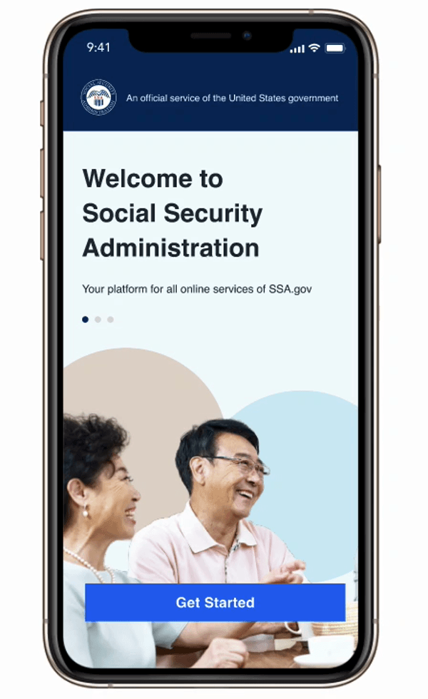
Ideation
Brainstorming
Through these insights, I proposed a a new mobile platform, which does not currently exist, as a design solution. This would provides an alternative and convenient access to information, services, and processes in real-time, optimized for readability.
Product Goals:
-
Allows users an alternative method to find basic information, eligibility requirements, check for application status, and apply.
-
Use establish research and insights to inform design solutions.
-
Creates a solution that maintains user interest and motivation.
User Flow
A draft of the pathways users will use to navigate was developed to be used as the framework for the wireframe and prototype. This flow took the user from the landing page through several pathways: SSDI basics, requirements, and benefits. An account home and several application flows were integrated to guide users in knowing where to apply and the status of current application.

Concept Sketches
A mobile platform provides users an alternative and functional opportunity to information, services, and processes in real time and are optimized for hands on interaction.

Wireframes
A draft of the pathways users will use to navigate was developed to be used as the framework for the wireframe and prototype. This flow took the user from the landing page through several pathways: SSDI basics, requirements, and benefits. An account home and several application flows were integrated to guide users in knowing where to apply and the status of current application.


Disability Benefits overview
The Disability Benefits page went through a few iterations based on peer feedback and some usability tests. Although the first version is organized, the text is too tight, which makes readability difficult. Second version took into consideration collapsible menus as defined in the heuristic evaluation and competitive analysis. Users mentioned how they preferred this approach of presenting information.

Text is small and possibly unreadable for users. CTA is placed at the bottom, which is not strategically placed.

Collapsible menus allows users to view dense information easier. Each section is kept brief to give just a general overview and give user the choice to learn more.

Final version incorporates changes to help create a smoother user experience and streamline the process of finding disability requirements.
Design
User Interface & Design Solution
-
The brand was intended to be consistent with the current visual interface of SSA.
-
Collapsible headers to guide information hierarchy and chunks information to limit cognitive and memory overload.
-
Breadcrumbs implemented at various pathways to support recovery and minimize errors.
-
CTAs implemented with consistent elements and icons to guide users in pathways with high-intended traffic (application).
-
Navigation bar implemented to facilitate navigation and offer more control.
-
Inclusion of account home to act as hub for specific systems such as application status.
Next Steps
User Interface & Design Solution
Within the current project scope, it would have been beneficial to conduct detailed user interviews to highlight additional qualitative data and missed behavioral or contextual insights.
• Re-designing the card sort test in a way that better informs information architecture.
• The use of a tree test to inform how to improve user pathways.
Due to limitation in time, I was not able to test the design solutions with actual users. Being able to conduct A/B test or a comparative task test with the iterative prototypes could validate my design or present additional iterative efforts.

In addition to ideating a mobile platform, SSA would also benefit from a redesign to its website. Given additional resources (mainly time), this is definitiely a project I would like to revisit.
Reflection
Following the conclusion of the project, there were several missed opportunities for insights and iterative design. Being mindful that the project scope encompassed ONE specific pathway, the recommendations were somewhat repetitive and reinforced one another. Given more time and resources, there are many more meaningful opportunities.
Within SSA, there are several other services offered on the platform such as retirement or healthcare information. Future efforts can be invested into evaluating additional systems, notably the Social Security Income (SSI) pathway and comparing that process to SSDI. While this can be a larger investment and undertaking, it can present unique insight opportunities for both user pathways.
