Role
UX Designer
Researcher
Project Duration
3 Weeks
Methods
Competitive Analysis
Usability Tests
Prototyping
Project Overview
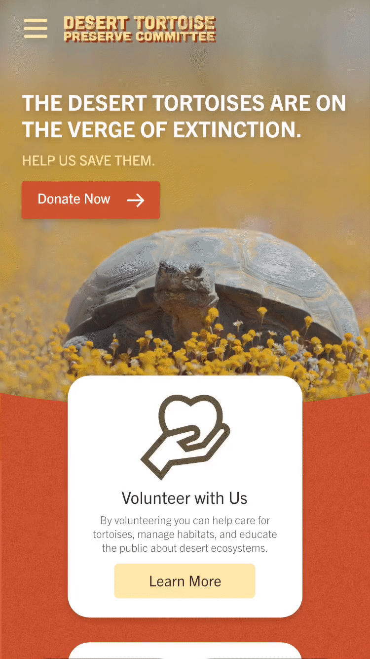
The premise of the project was to redesign a non-profit organization’s website in roughly 2 weeks. My team consisted of 3 UX/UI Designers. Tasks were divided amongst the team equally. Each designer had a hand in every step of the process. We were responsible to complete a high fidelity Responsive Web Design solution with a clickable prototype. My team looked into local organizations and stumbled upon across The Desert Tortoise Preserve Committee (DTPC).
Collectively, we had very little knowledge about tortoises but there was an attractive uniqueness to it. They live behind their mission, which is, “(The Desert Tortoise Preserve Committee is) dedicated to the recovery and conservation of the Desert Tortoise and other rare and endangered species inhabiting the Mojave and western Sonoran deserts”. We came to an agreement that we wanted to bring awareness and exposure to such a niche/unpopular market.
Design Challenge
We wanted to bring awareness/exposure to the tortoise market. This could be done by creating clear intentions on the web pages. Our team wanted to increase foot traffic and conversion rates for the organization.At the same time, we wanted to highlight the organization's character and have it shine through in the redesigned pages.
Discovery
Web Audit
Our initial impressions were that the website had good structure and content to work with. Visitors are welcomed with a carousel of hero images and subtle call to action statements. Navigation was decent but there were layers of categories to look through. There were hiccups on the website that needed some improvements.
Firstly, we could not tell what name the organization went by. We thought it was Tortoise Tracks, which reflected in the URL. However upon further investigation, the logo and content revealed it was not. Furthermore, it was unclear what the intention of the pages were. Visitors could easily get confused as to how to go about the website. In addition, there was a lack of transparency on how The DTPC allocated their funds.

Visit the old site
We noted that it was imperative to have a dedicated page to display their financial information. The DTPC had this information but it was buried deep within one of their newsletters. It was not easily accessible. As a result, users would not be completely comfortable to donate their time or money to The DTPC. Nevertheless, The DTPC provided my team with a good foundation to work with.
Competitive Analysis
We initiated our research phase by conducting a competitor and SWOT analysis. My team wanted to see what competitors were on the market to better differentiate The DTPC. We compiled a list of both appealing and unappealing qualities. We were able to highlight their most important features and discovered new features that could be implemented in the redesign. We plotted their competitors based on the number of features they offered and the quality of aesthetics on their websites. Additionally, we placed where the DTPC currently is comparison with the competiors and where we wanted the redesign to be.
We did not want to provide too many offerings in the case that our users would get overwhelmed. This meant we would need to emphasize the main CTA buttons and not muddle up the page with unnecessary information. In addition, we did an ethnographic observation and had a user look through all the websites. Our goal was to have our user identify which tortoise nonprofit organization they would donate to solely based on the website. Our findings can be found below.


• Photos are important to connect one emotionally with the cause
• Calls to action need to be clear and prominent
• Having a mission statement on the home page is nice but not essential
Findings
Research
User Interviews
To continue our discovery phase, our team conducted user interviews and surveys. We wanted to understand how users are involved with nonprofit organizations, primarily through donating or volunteering. In addition, we wanted to know what features factor into their decision. Key takeaways were that transparency and overall layout are pivotal factors when determining what organization to donate to.
“At this point in my life, I’m more inclined to give money than time, even though I really have neither.”
“When I was in college and high school I used to do a lot of volunteer work, but life got in the way.”
Our research shows that all participants mainly donate to nonprofits as opposed to volunteering. Due to their time and schedule restrictions, people are not as openly available to volunteer. We took this data and concluded that overall look, transparency, and credibility would be the driving forces of our redesign. As a result, these components needed to be showcased in order for users to have an emotional connection to The DTPC. Users should also be able to easily find financial information and see where funds would be allocated. We wanted to make the website friendly and inviting but also have professional look to maintain credibility.


THE PROBLEM
Users do not feel comfortable donating their money to an organization that doesn’t show how they spend their funds. Nor if the website does not have an air of credibility through a more professional looking design.
THE SOLUTION
Highlight allocation of funds by the organization and give the website a more inviting design with prominent calls to action to entice users to donate.

Feature Prioritization
Continuing our process, we defined certain features we wanted to implemented into the redesign. We plotted it on a chart to see where we wanted to direct our efforts. The High Cost/ High Impact quarter is a result of our findings. It was imperative that we had to showcase The DTPC's financial data and information for users to trust the organization. Also with the old website, it kept constantly crashing while my team was analyzing the website. Therefore, it was crucial to avoid this and provide reliable hosting for our users.

Card Sorting
The DTPC had a copious amount of information to work with. This was good and bad. It could be too overwhelming for visitors to go through. Many probably would leave the page. My team decided to condense it to be more brief and concise. We began by card sorting with what the website had. Following, a user flow was made to display what we would want our user to do.
We believe our user would initially explore the website to get a better understanding of desert tortoises. About the Desert Tortoise, Why Trust Us, and Our Accomplishments are possible pages they would visit before they would contribute a donation. Finally, they probably would go through the donation process after they throughly researched the site.


User Persona
With the completion of our user interviews and surveys, we created a persona, Mary Wilson, to reflect our potential user’s goals, needs, and frustrations. In addition, a story was written to illustrate a possible scenario.

Storyboard

Ideation
Sketches/Wireframes
We began sketching to get an idea of what the new website should look like. My team collaborated on Invision Freehand. We wanted to keep the pages simple while highlighting key features such as the donation button and easy navigation.

Brand Identity
In regards to style, we wanted a consistent theme throughout the website. Initially, hues of green were suggested for our color scheme but we decided to do more warm tones such as oranges and yellows. We felt that this would better represent tortoises and create the feeling of a desert. Additionally, we also included a sand texture in the redesigned logo and throughout the website. This gave some extra depth and dimension to the overall visual design.
When it came to typography, Cubano seemed like a viable option since it is used for outdoor related material. This portrayed the outdoorsy feeling we were going for and played well into the redesign. My team also redesigned the logo to make it simple but impactful. We felt like it was crucial because it must represent the organization well and clearly. First impressions are important and a logo can attract visitors.

Design
User Testing
In regards to user testing, we wanted to find out if there were any gaps with our prototype. We let our users explore and play around the pages. The main task was to have the user make a donation.
Goal: allow the user to explore the website and ensure that the donation process is straightforward and easy to understand
Check out the prototype

Overall, our participants found it easy to navigate. Our test findings revealed some possible adjustments. We got helpful feedback to improve the overall design. In addition, it was noted that we had to be mindful about maintaining consistency throughout the pages. One major change was in our donation process. Originally, we designed the donation page to display testimonials and display different stories to persuade donations.
However, we discovered that our users were ready to make donations and we did not want to prolong the process. As a result, the donation page was changed solely for transactions. Another suggestion was to add a link at the end of the donation process. We did not want our user to be left on the page without any guidance of what to do next. All feedback was taken into consideration when it came to iterations.
Next Steps & Further Development
We reflected on the entirety of our project and further development we wanted to take with The DTPC. My team felt successful in achieving our client’s goals with the given timeframe. If we had additional time, we would have liked to expand upon the site even more.
• Design the rest of the pages for both desktop and mobile prototypes
• Conduct research on current member base
• Update on organization’s accomplishments and financials

We would like to work on making a fully functioning website and mobile site. Our prototype was only able to display user flows to a certain stage. By reaching full completion in the process, users would get a more real, usable experience. In addition, we would conduct further user research and data analytics to increase retention rate. Additionally, we would have liked to add more animations.
We believe this would have enhanced the experience and make users want to stay on longer and explore through the website. It is pivotal to keep websites as current as possible. Users like to know that organizations are active and what they are working on. Projects and financials would greatly entice users to invest in the cause. All these factors can contribute to heightening The DTPC’s reputation and credibility.